Quick Facts
| Detail | Information |
| Creator | Vanessa Otero — patent attorney, Denver, Colorado |
| Origin blog | “All Generalizations Are False” |
| First version published | 2016 |
| Company founded | 2018 |
| Company type | Public benefit corporation, Colorado |
| Latest flagship chart | January 2026 — 137 sources total |
| Flagship breakdown (Jan 2026) | 100 web/print, 19 podcast/audio, 18 TV/video |
| Total sources ever rated | Over 1,200 |
| Flagship release schedule | Twice yearly — January and August |
| Niche charts released | Monthly — web/print, podcast, TV/video |
| 2020 rating project size | ~1,800 articles/shows, 120 analysts |
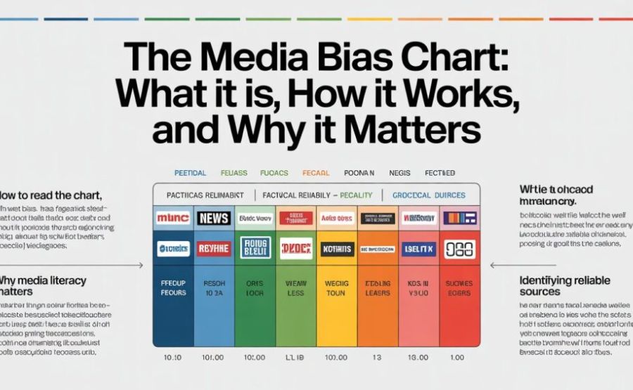
| Two axes | Political bias (horizontal) and reliability (vertical) |
| FTC investigation | Issued June 2025, still ongoing |
| Notable 2026 shift | The Epoch Times reliability score rose 10+ points after editorial changes |
| Main competitor | AllSides — founded 2012 |
| Membership program | “News Nerds” — annual members get merch + premium chart access |
A Map for a World That Feels Unmappable
You can see it in a matter of seconds by pulling up any social media feed. Two people sharing completely different versions of the same news story. Both convinced they’re right. Neither one is able to understand how the other person could believe something so obviously wrong.
That gap between people isn’t really about facts most of the time. It’s about where those facts came from.
The Media Bias Chart was built to close that gap, even just a little. Not by telling you what to think. Just by showing you, plainly, where your information is coming from — how far left or right it leans, and how solid the reporting actually is underneath that lean.
It started as one woman’s frustration with Facebook arguments. It’s now a tool referenced in classrooms, newsrooms, and corporate brand safety meetings across the country.
How a Denver Lawyer Started All This
Vanessa Otero wasn’t trying to build a company. She was a patent attorney in Denver who kept watching the same fight play out online.
People would argue past each other constantly. Someone would share an article. Someone else would dismiss it instantly, without reading it, just based on where it came from. Neither side seemed to agree on which sources could even be trusted as a starting point.
Otero ran a personal blog called “All Generalizations Are False.” In 2016, she sketched out a chart — a simple grid plotting news outlets by political lean on one axis and reliability on the other — and posted it there.
It spread far beyond anything she expected. The image got shared, reposted, and argued about across social platforms. People were hungry for exactly this kind of visual shorthand.
In 2018, she turned the idea into something more formal. Ad Fontes Media was founded as a public benefit corporation based in Colorado. The name, taken from Latin, means “to the source” — a fitting description of the entire mission. Instead of relying on reputation or gut feeling, Otero wanted to actually read the content itself and rate it on what was really there.
The Two Lines That Explain Everything
Once you understand the chart’s basic structure, the whole thing clicks into place quickly.
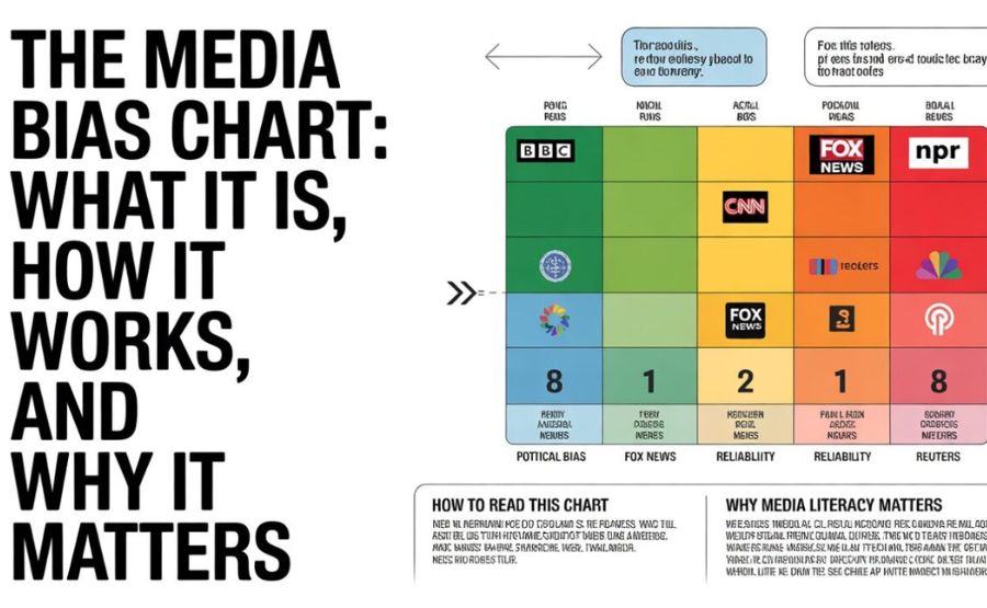
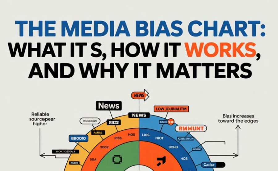
Run your eyes left to right. That’s the political bias axis. Far left means strongly progressive framing. Far right means strongly conservative framing. Dead center means a source generally avoids pushing a political direction in its content.
Now run your eyes bottom to top. That’s reliability. The bottom holds sources that traffic in fabricated or wildly inaccurate information. The middle holds sources mixing fact with heavy analysis and opinion. The top holds sources delivering original, fact-checked, verified reporting.
Plot enough sources on this grid and a pattern emerges that Otero and her team describe as an inverted U shape. Sources near the political center tend to cluster higher on reliability. Sources pushing toward either extreme tend to sink lower on reliability, more often blending propaganda, fear-based framing, and unverified claims into their content.
This pattern isn’t a coincidence and it isn’t a political statement either. It reflects something structural about how extreme framing and rigorous fact-checking tend to pull against each other.
Who Actually Does the Rating
This is the part people are most curious about, and rightly so. Who decides where a source lands on this chart?
Ad Fontes built a system specifically designed to avoid one person’s bias driving the results. Every piece of content gets reviewed by analysts spanning the political spectrum — someone who leans left, someone who leans right, and someone closer to the center.
Each analyst rates the same article or broadcast independently. Then the scores get compared. If there’s a big gap between analysts, they discuss the discrepancy and see if anyone changes their assessment after hearing the other perspective. The final score is an average.
This isn’t a casual side gig for most analysts either. Every analyst holds at least a bachelor’s degree. The majority hold graduate degrees. About a third have a doctorate or are working toward one. Each analyst also completes a political identity assessment before joining, so the team’s balance across the spectrum is verified rather than assumed.
During one major rating effort in September 2020, 120 analysts worked through nearly 1,800 individual articles and TV segments. Each analyst reviewed roughly 370 articles and 17 TV shows, pulling from over 100 different news sources represented on the chart at that time.
That’s not a quick weekend project. That’s a sustained operation requiring real institutional infrastructure.
The January 2026 Flagship Chart: What Changed
Ad Fontes only releases its full flagship chart twice a year — January and August. The rest of the year, they publish smaller, format-specific charts covering web and print, podcasts, and TV separately.
The January 2026 flagship release covers 137 total sources. That breaks down to 100 web and print outlets, 19 podcast and audio shows, and 18 TV and video programs.
One detail that surprises a lot of first-time viewers: Associated Press and Reuters don’t always appear on the flagship chart, even though they’re widely considered gold-standard wire services. Ad Fontes addresses this directly — the flagship chart is, by design, a curated and necessarily incomplete snapshot. AP and Reuters are rated within Ad Fontes’s broader database of over 1,200 total sources; they’re just not always pulled into the smaller flagship visual.
One of the more notable shifts in the new chart involves The Epoch Times. Since Ad Fontes first rated the outlet back in 2019, its reliability score has climbed more than 10 points, and its bias score has improved by roughly 8 points. The explanation given is specific: leadership changes at the outlet led to the removal of a large batch of older, low-reliability articles, replaced instead with brief editor’s notes acknowledging the original issues. The Epoch Times now sits just below what Ad Fontes calls the “green box” — the zone representing solid reliability — in the “skews right” category.
Another point worth knowing: Ad Fontes rates the websites for MS NOW (the rebranded MSNBC) and Fox News as more reliable and less biased than their respective television broadcasts. Print and digital reporting from a network often goes through a different editorial process than live cable commentary, and the chart captures that distinction rather than treating an entire brand as one monolithic source.
Why People Keep Misreading the Chart
Here’s the single biggest misunderstanding that trips people up, and it’s worth addressing directly.
When someone says they don’t trust a news source, they’re usually describing one of two completely different complaints. Either they think the source frames stories in a way they politically disagree with, or they think the source actually publishes false information.
These are not the same problem, and conflating them causes most of the chart’s controversy.
A source can sit clearly to one political side and still report verified, accurate facts with real rigor. A source can sit dead center on the political axis and still publish sloppy, cherry-picked, or sensationalized content that misleads readers.
The whole design of the Media Bias Chart exists to keep these two things separate. Bias tells you about framing and editorial slant. Reliability tells you about factual accuracy and journalistic rigor. They’re measured independently because they answer different questions entirely.
AllSides: The Other Major Player
Ad Fontes isn’t the only organization doing this kind of work. AllSides has been operating since 2012 — four years before Otero even published her first chart sketch.
The two organizations take meaningfully different approaches. AllSides limits itself to written, online content. No television, no podcasts, no radio broadcasts. Ad Fontes covers all of those formats.
AllSides also uses a simpler five-category scale: Left, Lean Left, Center, Lean Right, Right. It’s less granular than Ad Fontes’s detailed numerical scoring system, but it’s also easier for a casual reader to digest at a glance.
There’s one more important distinction. AllSides explicitly states it does not rate accuracy or credibility — only political lean. Their stated reasoning is that they don’t want to position themselves as an arbiter of truth, a kind of “Ministry of Truth” deciding what counts as accurate. Ad Fontes takes the opposite approach, measuring both bias and reliability simultaneously.
Neither approach is more correct than the other. They’re answering different questions. Many media literacy educators recommend cross-referencing both tools rather than relying on just one.
The Counter-Chart and the InfoWars Controversy
Not everyone has taken kindly to where the Media Bias Chart places them.
In 2018, InfoWars founder Alex Jones reacted to his outlet’s placement in the chart’s bottom-right corner — labeled “nonsense damaging to public discourse” — by accusing Ad Fontes of representing what he called the “dying dinosaur media’s extreme liberal bias.”
InfoWars responded by publishing its own counter-chart. In that version, InfoWars positioned itself as “independent” and representing “freedom,” while labeling established outlets like the Associated Press with terms like “tyranny” and “state-run corporate/foreign influences.” Journalists widely mocked the counter-chart on social media at the time.
This episode is worth remembering because it illustrates something important. Pushback against the chart doesn’t always come from a place of careful methodological critique. Sometimes it’s simply a reaction from a source unhappy with an honest assessment of its own content.
The 2025 FTC Investigation
This development surprised a lot of longtime followers of the chart.
In June 2025, the U.S. Federal Trade Commission sent civil investigative demand letters to several media rating organizations, including Ad Fontes Media. These letters required the company to disclose detailed information about its internal operations, its finances, its rating methodology, and its relationships with other organizations across the media industry.
This investigation sits within a broader wave of government scrutiny directed at companies that evaluate media sources for misinformation, hate speech, and deceptive content. As of this writing, the investigation remains ongoing, and what it ultimately means for Ad Fontes’s future operations isn’t yet clear.
There’s a reasonable question buried inside this story. Organizations that rate other organizations for trustworthiness should themselves face scrutiny and accountability. Whatever the outcome of the FTC’s inquiry, it’s a useful reminder that no rating system — including this one — operates immune from outside examination.
How Businesses Actually Use This Tool
The Media Bias Chart isn’t just a classroom resource. It has practical business uses that influence how digital advertising operates.
Companies use Ad Fontes’s ratings for what’s called brand safety — making sure their advertisements don’t end up running alongside extremist, low-reliability, or otherwise damaging content. A major brand doesn’t want its name appearing next to a fabricated conspiracy article, and the chart gives advertisers a documented, third-party basis for those placement decisions.
News organizations themselves also pay attention. According to people who’ve interacted directly with Ad Fontes, outlets sometimes reach out to ask exactly which articles or instances led to a particular rating. When given the specific evidence behind a score, some outlets have made editorial adjustments — which is part of what may explain shifts like The Epoch Times’s improved 2026 rating.
That feedback loop is arguably the chart’s most underappreciated function. It’s not just informing readers passively. It’s occasionally nudging outlets toward better practices because their rating is publicly visible and consequential to their advertising revenue.
What the Chart Can’t Do
Honesty matters here. The Media Bias Chart is genuinely useful, but it has real limitations that deserve acknowledgment.
A single overall score for an outlet doesn’t capture every individual article that outlet publishes. A generally reliable source can still publish a flawed piece. A generally unreliable source can occasionally produce solid reporting.
Critics on both political sides have accused the chart of bias against their preferred outlets — which is, in its own strange way, a small piece of evidence that the chart isn’t simply functioning as a partisan weapon for either side. Right-leaning critics argue it inflates the credibility of mainstream left-leaning outlets. Left-leaning critics argue it grants conservative media unearned legitimacy by positioning some of it near the political center. Both critiques can’t simultaneously be fully correct, which suggests the truth sits somewhere more complicated than either side wants to admit.
Academic researchers have also pointed out that no human-driven rating system can claim to objectively and perfectly measure something as fluid as media bias. That’s a fair and important caveat. The chart represents a careful, transparent, documented attempt at the task — not a final, unquestionable verdict.
Final Words
The Media Bias Chart started with one frustrated person watching online arguments go nowhere. It’s become something bigger — a working reference point used by teachers, advertisers, news organizations, and millions of ordinary readers trying to figure out who to trust.
It isn’t perfect. No single chart could be. But it does something genuinely valuable. It separates two questions that people constantly tangle together — whether a source leans politically in one direction, and whether a source actually tells the truth. Those questions deserve separate answers, and most of us never stop to ask them separately at all.
The January 2026 update shows the chart is still a living, evolving project. Outlets can improve their standing. Methodology gets refined. New scrutiny — including a federal investigation — keeps the organization itself accountable, the same way it tries to hold news outlets accountable.
Use it as what it actually is: a starting point, not a verdict. Check where your sources land. Then go read something from the other side of the chart and see what you’ve been missing. That’s the whole point.
FAQs
Q1: Who created the Media Bias Chart?
Vanessa Otero, a patent attorney from Denver, Colorado, first published the chart on her personal blog in 2016. She founded Ad Fontes Media as a formal public benefit corporation in 2018.
Q2: What does “Ad Fontes” mean?
It’s Latin for “to the source.” The name reflects the organization’s core method — rating media by directly analyzing the actual content of a source rather than relying on reputation alone.
Q3: How many sources has Ad Fontes rated?
Over 1,200 total sources across their full database. The January 2026 flagship chart specifically displays 137 of those sources: 100 web/print, 19 podcast/audio, and 18 TV/video programs.
Q4: Why isn’t AP or Reuters always shown on the chart?
The flagship chart is a curated, necessarily incomplete snapshot released only twice a year. AP and Reuters are rated within Ad Fontes’s larger database, but space constraints mean the flagship visual doesn’t include every rated source.
Q5: How often is the chart updated?
The full flagship chart releases twice yearly, in January and August. Smaller, format-specific charts covering web/print, podcasts, and TV/video are released monthly throughout the year.
Q6: Who rates the content for the chart?
Teams of analysts spanning the political spectrum — left-leaning, right-leaning, and centrist — independently review the same content and average their scores. All analysts hold at least a bachelor’s degree, most hold graduate degrees, and roughly a third hold or are pursuing doctorates.
Q7: What are the two axes on the chart?
Political bias is measured on the horizontal axis, which runs from far left to extreme right. The vertical axis measures reliability, from fabricated/inaccurate content at the bottom to original, fact-checked reporting at the top.
Q8: Does political bias automatically mean a source is unreliable?
No. Bias and reliability are measured as separate, independent dimensions. A source can lean clearly in one political direction while still reporting verified facts accurately.
Q9: What happened with InfoWars and Ad Fontes?
In 2018, InfoWars founder Alex Jones criticized the chart’s placement of his outlet at the low-reliability, high-bias corner. InfoWars released a counter-chart placing itself as “independent” while labeling outlets like AP as “tyranny.” Journalists widely mocked the InfoWars chart.
Q10: What’s the difference between Ad Fontes and AllSides?
AllSides, founded in 2012, only rates online written content using a simpler five-point bias scale and does not measure reliability at all. Ad Fontes covers web, print, TV, and podcasts, and measures both bias and reliability with detailed numerical scoring.
Q11: What happened with the 2025 FTC investigation?
In June 2025, the FTC sent civil investigative demand letters to several media rating firms, including Ad Fontes Media, requesting details about operations, finances, methodology, and industry relationships. The investigation was part of broader government scrutiny of media rating organizations and remains ongoing.
Q12: Why did The Epoch Times’s rating improve in 2026?
After leadership changes at the outlet, a large batch of older, low-reliability articles was removed and replaced with editor’s notes acknowledging the original issues. This led to a reliability score increase of more than 10 points and a bias score improvement of about 8 points since Ad Fontes’s original 2019 rating.
Q13: Do Fox News and MS NOW (MSNBC) get the same rating for their website and their TV broadcast?
No. Ad Fontes rates the websites for both outlets as more reliable and less biased than their respective television broadcasts, reflecting differences in editorial process between digital reporting and live cable commentary.
Q14: Is the Media Bias Chart free to use?
Static chart downloads are free for educational, non-commercial, and civic purposes. Commercial licensing applies for business use. An interactive online chart and annual “News Nerds” membership with premium access are also available.
Q15: Should I trust the Media Bias Chart completely?
Treat it as a well-researched starting point, not a final verdict. It uses a transparent, documented, politically balanced methodology, but a single score can’t capture every individual article a source publishes. Use it alongside your own critical reading and, ideally, alongside other tools like AllSides for a fuller picture.
Keep discovering, connecting, and thriving with The Nexus Magazine every day.